
Are PR professionals missing a trick by not making more of infographics?
What do you think of when you hear the word ‘infographic’? Your response will of course be age, industry and experience dependent; PR veterans will shudder at the memory of clip art (Google it under 30s), but seasoned professional, newbie or somewhere in-between, you’ll probably have noticed that many people are lagging behind when it comes to making the most of infographics.
‘Only 42% of press releases included any form of multimedia in 2015’*
Let’s get our terminology straight at the outset. Wikipedia defines an infographic as a ‘visual representation of information, data or knowledge intended to present information quickly and clearly.’ Perfect for PR!
So here’s a whistle-stop tour of our favourite 5 types of infographic, with our recommendations for uses in your PR campaign:
- The timeline and ‘how-to’ guide
The timeline is a powerful tool when it comes to telling a chronological story and demonstrating how things have changed over time. Timelines also make long, complicated stories easier to understand, so lend themselves well to organisational anniversary stories.
Timelines can also be utilised as ‘how-to’ guides, demonstrating how one thing leads to another, and can include illustrations and symbols to make information more easily digestible. A good example of this are wordless user manuals that convey instructions in a linear, pictorial style.
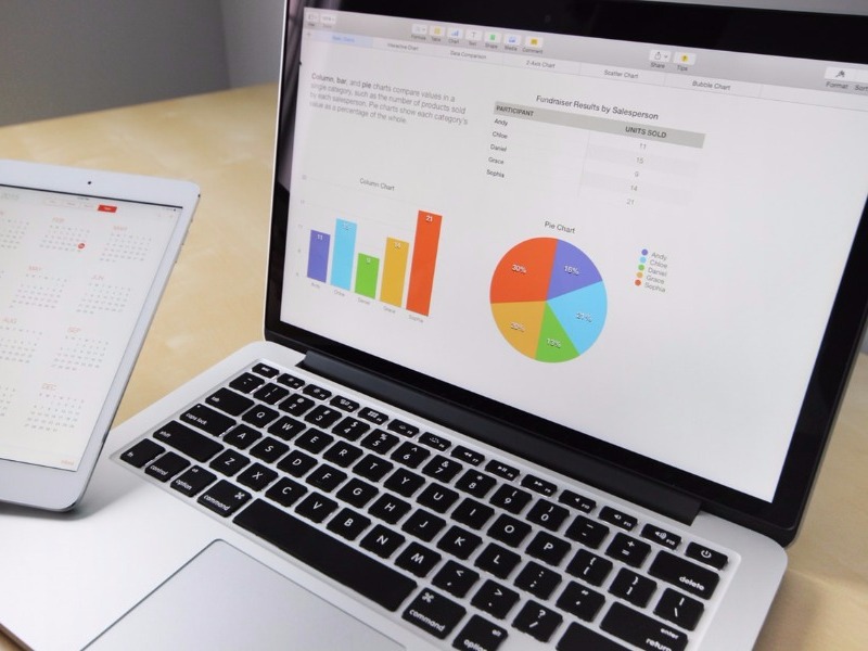
Data presentation
From graphs to pie charts and pictorial graphics, a well-constructed infographic can communicate your data-driven arguments and make your facts and figures more interesting and engaging. Journalists receive hundreds of press releases on a daily basis.
But the truth is they simply don’t have the time to read press releases in detail; if your data-backed argument is clear and concise and supported by a strong, data presentational infographic, your story is much more likely to make the news.
Take a look at our infographic for our 2017 survey results, where we’ve used a colourful infographic to highlight data-backed social media trends to tie in with @socialmediaweek 2017.

We also created this infographic for our client WES, to highlight the top 10 causes of fire on construction sites.

- Versus
Compare and contrast, either or, pros and cons, fors and againsts. Whatever comparison you want to make in order to highlight your salient points, the ‘versus’ infographic is a good choice for comparing two things in a head-to-head study.
A versus infographic can highlight the differences between two similar things, prove that one option is better than or inferior to another and highlight similarities between two things. A direct comparison visual is also an excellent way for companies to compare products and/or services without being overly contentious or inflammatory.
Some of our favourite examples can be found online, using search terms like ‘Facebook versus LinkedIn infographic’. Happy searching!
- Maps
Put simply, maps, when used as infographics, convey information tied to geographic location. Based on research findings, they can convey demographically unpalatable information in a concise and unemotional way.
Maps are therefore an excellent infographic tool when it comes to presenting information about places and cultures, similarities and differences, in a way that is factual and tied to geography rather than opinion.
Have a bit of fun with search terms like ‘eu referendum results infographic’ and others that are a bit contentious. Do you respond less emotionally to the map infographic than, say, an opinion piece? Do you understand the information quickly? Powerful tool isn’t it?
- Visual article
Make a piece of writing more visual and reduce the volume of text with a visual article infographic. Similar to data presentation tools, the visual article has, as you may expect, more text!
With a visual article, organisations can present their brand values with short snippets of well-written content containing key words in brand tone of voice, whilst also using visual triggers and linear flow associated with a well-crafted infographic. A visual article also takes the infographic from just ‘visual’ to ‘story’ and moves it into the powerful visual content arena.
A final thought about the inclusion of infographics in your PR campaign planning:
**90% of information that comes to the brain is visual
**Presentations (including press releases, articles, features and any other communication tool) containing visual aids are 43% more persuasive
**65% of people are visual learners.
What are you waiting for?
Dragonfly PR specialises in creative PR and social media campaigns for the construction and manufacturing sectors.
For a free no-obligation review of your requirements, email hello@dragonflypr.co.uk or call: 01709 300130 to find out more.
*source www.prnewswire.com
** https://blog.kissmetrics.com